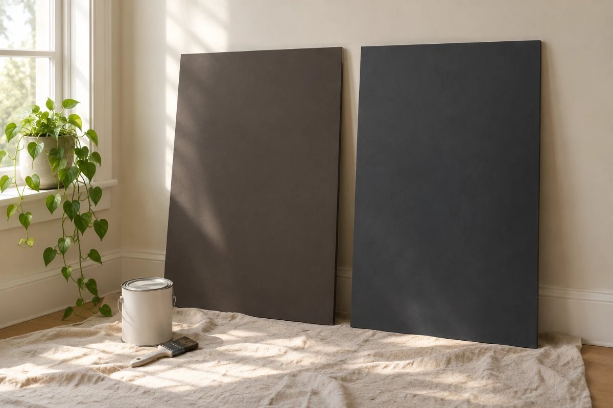
Two of the most popular dark paints from Sherwin-Williams often end up on the same shortlist, because both are deep, moody and surprisingly easy to live with. The Urbane Bronze vs Iron Ore question is really a question of warmth: one is a warm, earthy bronze-gray, and the other is a deeper, more graphic charcoal.
This guide compares them on five checks: light reflectance value (LRV), undertones, light, trim and room fit, with notes on testing and prep. LRVs are published numbers from color databases, so confirm both on the chips.
Quick Answer: Urbane Bronze vs Iron Ore
- Urbane Bronze (SW 7048): a warm, earthy bronze-gray, LRV about 10 (published).
- Iron Ore (SW 7069): a deep, striking charcoal, LRV about 6 (published).
- Easy pick: Urbane Bronze for warmth and wood; Iron Ore for a bold, graphic look.
- Close in depth: both are very dark, so undertone matters more than lightness.
- Test: compare large boards in your own room, at night with lamps on.
What Each Color Is
Sherwin-Williams describes Urbane Bronze SW 7048 as a bold neutral that invites feelings of moody modernity, natural healing and sophisticated serenity, and it was the January 2021 Color of the Month. It describes Iron Ore SW 7069 as a striking charcoal that brings lavish comfort, and it was the March 2022 Color of the Month. In the Urbane Bronze vs Iron Ore comparison, both are dark neutrals, but Urbane Bronze is warm and brownish and Iron Ore is a cooler, darker charcoal.
The 5 Checks at a Glance
| Check | Urbane Bronze | Iron Ore |
|---|---|---|
| Code | SW 7048 | SW 7069 |
| Published LRV | About 10 | About 6 |
| Feel | Warm, earthy, soft | Deep, graphic, bold |
| Undertone | Brown-gray, faint olive | Charcoal, can lean blue or brown |
| Best for | Offices, living rooms, cabinets | Doors, cabinets, accent walls |
Check 1: LRV
LRV runs from 0 (black) to 100 (white). Published figures put Urbane Bronze at about 10 and Iron Ore at about 6, so both are very dark and absorb most of the light. Iron Ore is the darker of the two by a small margin. These numbers come from color databases rather than the Sherwin-Williams pages I read, so confirm both on the chips.
Check 2: Undertones
Urbane Bronze has a warm, brown-gray base, and some reviewers see a faint olive hint, so it feels soft next to wood and cream. Iron Ore is a deep charcoal that can lean slightly blue in cool light and slightly brown in warm light, so it looks more graphic. Check each against your floor, furniture and fabrics, since this is where the Urbane Bronze vs Iron Ore decision is often made.
How Each Color Looks in Different Light
Dark colors change a lot with the light, so judge both at several times of day.
| Room light | Urbane Bronze | Iron Ore |
|---|---|---|
| North-facing | Cooler, deeper, close to charcoal | Cooler, nearly black |
| South-facing | Warm bronze-brown, softest | Soft charcoal, a little warmer |
| East-facing | Lighter and cleaner in the morning | Deep but readable in the morning |
| West-facing | Warm and rich late in the day | Deep, with a warm glow |
| Lamp light | Velvety and cozy | Dramatic and graphic |
Trim and Coordinating Colors
The Sherwin-Williams pages I could read did not list coordinating colors for either, so choose by eye. A warm, creamy white keeps both soft, while a crisp white gives a graphic contrast. Painting trim the same color gives a seamless, drenched look. Brass hardware suits Urbane Bronze especially well, and black or brass both suit Iron Ore.
Which Should You Choose?
Choose Urbane Bronze if you want a warm, earthy dark neutral that works with oak, walnut and linen. Choose Iron Ore if you want a deeper, bolder charcoal that suits modern and graphic rooms. For another deep neutral that sits between them in warmth, see our guide to Benjamin Moore Silhouette.
Dark Dining Rooms
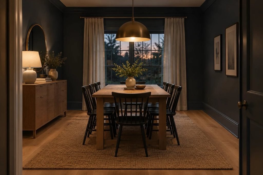
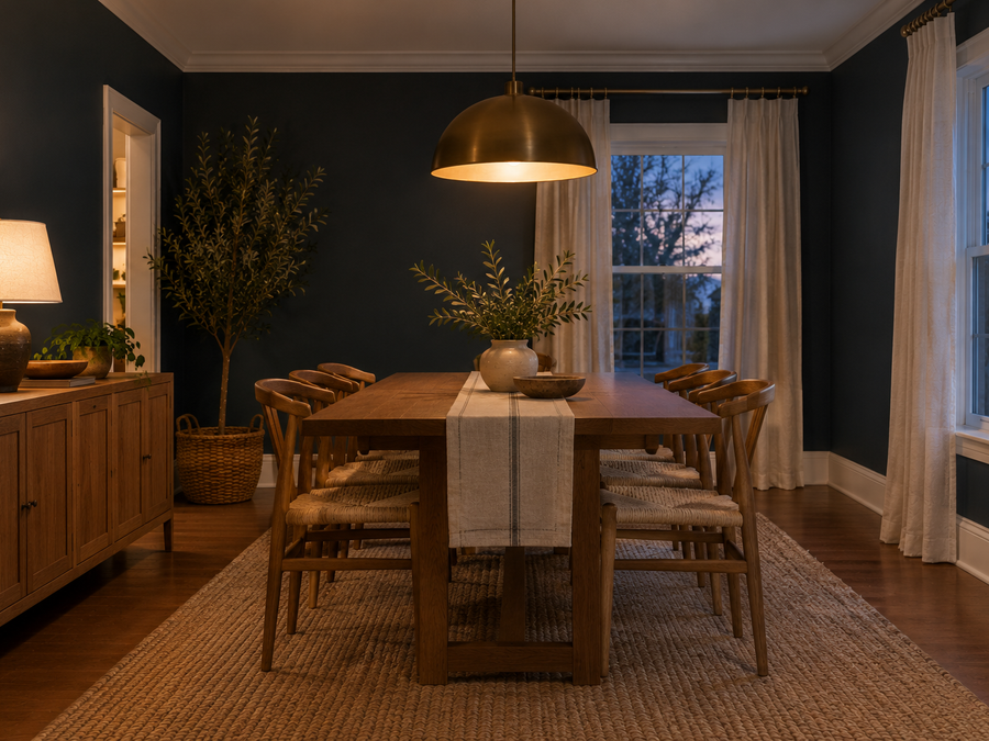
Both colors work well in a dining room, which is used mostly in the evening under warm light. Pair either with an oak or walnut table, brass lighting and warm white linen, and use warm bulbs around 2700K. Iron Ore feels more dramatic and graphic, while Urbane Bronze feels cozier. Add a lighter rug so the floor does not disappear.
Walls, Trim and Ceiling
Painting walls, trim and the ceiling the same color gives a seamless, cocooning look, and our guide to color drenching ideas for every room explains how to choose finishes. Use matte or eggshell on walls and satin on trim, so the surfaces differ just enough.
Cabinets and Doors
Both are popular on kitchen cabinets, built-ins and front doors. On cabinets, Urbane Bronze looks warm with brass pulls and a light stone counter, and Iron Ore looks sleek with black or brass hardware. For color and finish ideas, see our kitchen cabinet colour ideas. Use cabinet-grade enamel and a bonding primer.
Prep and Priming
Very dark colors need a tinted primer, usually two coats of paint and a good ventilation plan. Sand glossy surfaces lightly, wipe off dust and use a quality brush or roller so the coverage looks even. Open windows and follow the can’s safety directions.
How to Test Them
Paint two large boards, at least two feet square, one of each color, or use peel-and-stick samples. Put them on your brightest and darkest walls and look at them in the morning, at noon and at night with your lamps on. Hold them next to your floor and furniture, and follow the steps in our guide on how to paint a room.
Doing This as a Renter
Dark paint takes extra coats and may need to be covered when you leave, so ask your landlord. If you cannot paint, bring in the look with dark curtains, a large dark print, a deep rug and brass lamps.
Budget and Timing
Sherwin-Williams prices vary by product line and store, so check current costs. Both colors cost the same in the same line. A tinted primer and two coats are common, so allow a full weekend for an average room.
Where to Start If This Is Your First Time
Order samples of both and put them side by side on the same wall. Look at them for a few days, in daylight and at night. If you are still stuck in Urbane Bronze vs Iron Ore, think about warmth: wood and warmth point to Urbane Bronze, and a bold, graphic style points to Iron Ore.
Quick Recap
Urbane Bronze is a warm bronze-gray and Iron Ore is a deeper charcoal, with published LRVs of about 10 and about 6. Test both side by side at night, use a tinted primer and warm bulbs. The Urbane Bronze vs Iron Ore choice is mostly about warmth.
Using Both in One Home
If you like both, use Urbane Bronze in a living room or office and Iron Ore on a door or in a dining room, with the same trim throughout. When you pair them, the Urbane Bronze vs Iron Ore difference should look deliberate, and keeping ceilings and trim identical helps the home feel connected.
Common Mistakes to Avoid
- Judging from a tiny chip. Dark colors differ more on a full wall.
- Using cold bulbs. They make dark colors look flat.
- Skipping a tinted primer.
- Not testing at night.
FAQs
What is the difference between Urbane Bronze and Iron Ore? Urbane Bronze is a warm bronze-gray; Iron Ore is a deeper charcoal.
Which is darker? Iron Ore, at a published LRV of about 6 versus about 10.
Which is warmer? Urbane Bronze.
Which suits a dining room? Both; Iron Ore is more dramatic.
What trim goes with both? A warm, creamy white, or the same color.
Can I use both in one home? Yes, if the difference looks deliberate.
Tools and Basics to Gather
Two samples or large sample boards, painter’s tape, drop cloths, an angled brush, a roller, a tray, a stepladder and a tinted primer. Keep windows open and follow the safety directions on the can.
The Bottom Line
Urbane Bronze vs Iron Ore is a choice between a warm, earthy dark neutral and a deeper, bolder charcoal. Test both side by side in your own light, at night with your lamps on, and choose by warmth and style. Either way, you get a dark color that makes a room feel rich and finished.
Related:
Color Drenching Ideas for Every Room · Benjamin Moore Silhouette Paint Color