You may spend more hours in your home office than in any other room, so the color on the walls matters. A good palette helps you focus, keeps the room from feeling like a cubicle and looks good on video calls. The best home office color ideas are calm and easy on the eyes: soft blues, muted greens, warm neutrals and a few deep shades for people who like a cozy, enclosed feel.
This guide gives six easy palettes, with notes on lighting, finish and testing. Most color advice for offices comes from paint brands and retailers, so I treat it as style guidance, not science. Test samples in your own light.
Quick Answer: Home Office Color Ideas
- Soft blue: calm and clear, often suggested for concentration.
- Muted green: restful and easy on the eyes for long days.
- Warm neutral: low distraction, good for any style.
- Deep shade: charcoal or deep green for an enclosed, cozy feel.
- Avoid: all-white rooms and bright yellow or red walls; use them only as accents.
Why Color Matters in a Home Office
A home office is a place for focus, so its walls should support that without being dull. Paint guides suggest soft blues and muted greens for concentration and calm, with warm neutrals as an easy backdrop. One source notes that people made more errors in all-white rooms, and that yellow can raise anxiety, so use yellow and red as accents. The best home office color ideas balance calm with a little warmth.
The 6 Palettes at a Glance
| Palette | Feel (my impression) | Pairs well with |
|---|---|---|
| Soft blue | Calm, clear | White, walnut, brass |
| Muted green | Restful, natural | Oak, leather, brass |
| Warm neutral | Quiet, flexible | Oak, linen, black metal |
| Light gray | Clean, restorative | White, wood, navy |
| Warm clay or terracotta (accent) | Warm, energetic | Cream, rattan, green plants |
| Deep charcoal or green | Cozy, enclosed | Brass, leather, warm wood |
Palette 1: Soft Blue
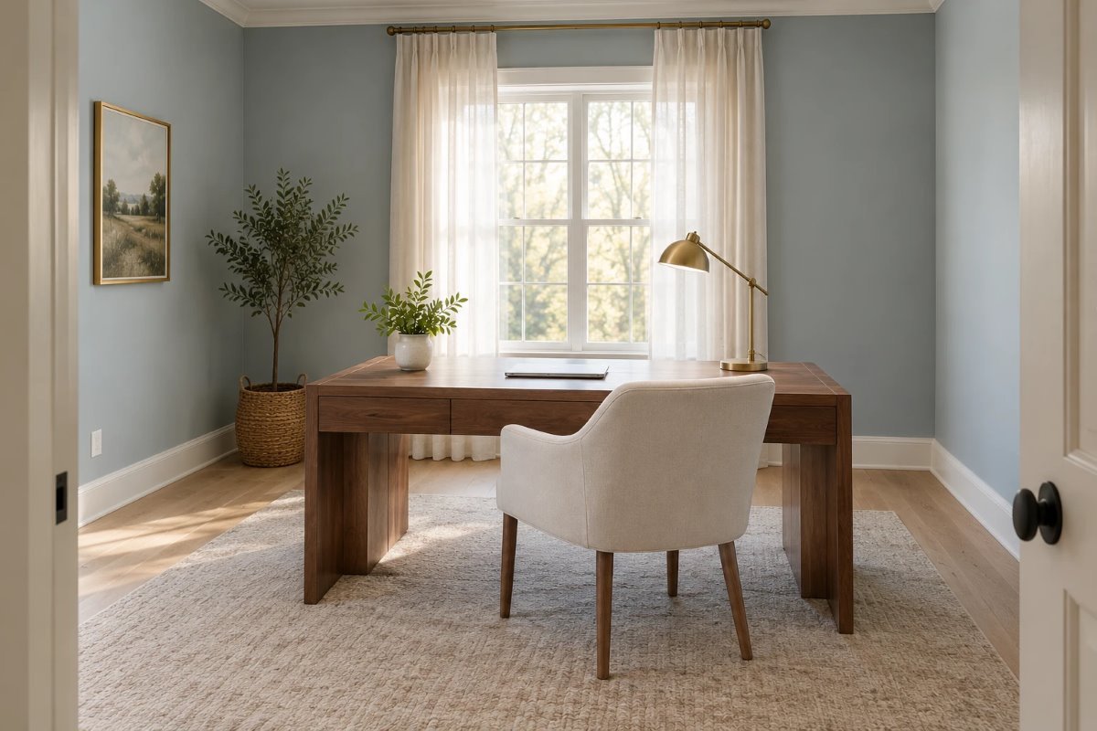
Soft blue is the classic for focus: it feels calm and clear and brightens a room with little daylight. Choose a dusty, slightly gray blue instead of a bright one, pair it with white trim and walnut, and keep the lighting warm so the blue does not feel cold.
Palette 2: Muted Green
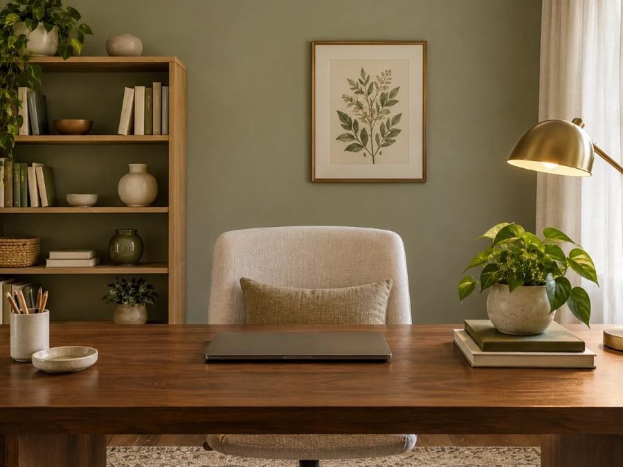
A muted green feels restful and natural, and is often suggested for long days at a desk. It pairs well with oak, leather and brass. For a shelf-filled office with a deep green, see our home library office ideas for small spaces.
Palette 3: Warm Neutrals
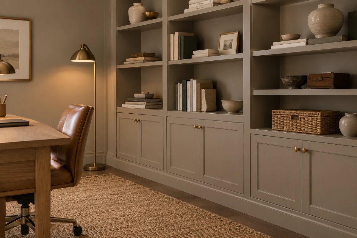
Warm whites, light grays and greige are low-distraction backdrops that suit any style. Pair them with wood, linen and black or brass metal, and add one deeper color in art or a chair. A warm neutral also looks good on camera, since it does not glare or wash out skin tone.
Palette 4: Light Gray
A light gray is clean and restorative and works with almost any furniture. Choose a warm gray if your room is north-facing, and a cooler one if it is sunny. Add warmth with wood and lamps so the room does not look like a lab.
Palette 5: Warm Clay as an Accent
Warm clay, terracotta and soft yellow can be energizing but strong on every wall. Use them on a chair, a rug or art instead of walls, or on one wall behind a bookcase. This gives a lift without the risk of distraction.
Palette 6: Deep and Enclosed
Some people focus better in a cozy, enclosed room. Deep charcoal, forest green or navy can do that, especially with built-in shelves painted the same color. For a seamless, drenched look, see our guide to color drenching ideas for every room. Add layered lamps so the room does not feel heavy.
Lighting and Glare
Paint looks different in natural and artificial light, so test your color with the lamps you will use. Put the desk at a right angle to the window to avoid glare, and add a desk lamp for task light; our guide to desk lamp height for a home office shows where to put it. Use warm-white bulbs for evenings and brighter neutral ones for daytime work, if your lamps allow.
Finish and Sheen
A matte or eggshell finish looks soft and cuts glare on camera and screens. Use satin or semi-gloss on trim and doors. Avoid high gloss on walls, which reflects the window and lamps.
Small and Closet Offices
In a small room or closet, a light color makes the space feel larger, and a deep color makes it feel snug if you commit. Paint the walls and the inside of the closet the same color, add a lamp and keep clutter off the desk. For layouts, see our closet home office for small spaces guide.
Video Calls
For video calls, choose a calm wall color behind your chair, such as a soft blue, muted green or warm neutral, and put the light in front of you. Dark walls can look moody on camera if the light is poor, and bright white can wash out skin tone.
Doing This as a Renter
Renters can bring color in without painting: a large piece of art, a colored chair, a rug, curtains and plants. If you may paint, choose a color that is easy to cover and keep the paint name for touch-ups.
Budget and Timing
Paint is the cheapest way to try home office color ideas, and a sample costs far less than repainting. An average office takes a weekend. A tinted primer helps with deep colors.
Where to Start If This Is Your First Time
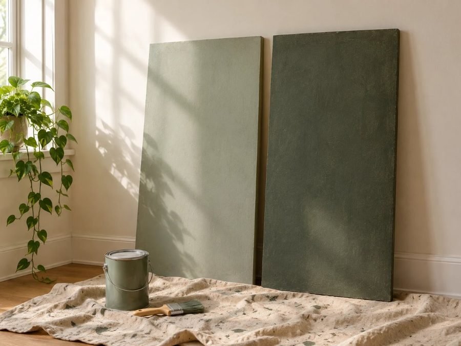
Paint two or three large sample boards, at least two feet wide, and move them around the room for a few days. Look at them in the morning, in the afternoon and with your desk lamp on. This is the easiest way to turn the home office color ideas above into one choice.
Quick Recap
Choose a calm color such as a soft blue, muted green or warm neutral, use accents for energy, test in your own light and keep the lighting warm. The best home office color ideas help you focus without making the room feel dull.
Matching Furniture and Accessories
Choose a desk, chair and shelves that suit the wall color: walnut and white look crisp on soft blue, oak and leather suit muted green and brass and black work with deep shades. Good home office color ideas also include a rug and curtains in a related tone, so the room feels like one space.
Using One Color in Two Rooms
If your office opens to a bedroom or living room, choose colors in the same family so the home feels connected. Many home office color ideas work better as a calm backdrop with one accent that repeats in the next room.
Common Mistakes to Avoid
- Painting everything white. It can feel flat and tiring.
- Choosing bright yellow or red for all walls.
- Skipping a test in your own light.
- Forgetting the lamp. Color depends on light.
FAQs
What color is best for a home office? Soft blue, muted green or a warm neutral are common picks.
Is white good for a home office? It can feel flat; add depth with wood and color.
Can I use a dark color? Yes, for a cozy, enclosed feel with good lighting.
What finish is best? Matte or eggshell for walls, satin for trim.
What color looks good on video calls? Calm colors such as soft blue, green or warm neutral.
Do colors really affect focus? Evidence is mostly from paint brands, so test what feels right.
Tools and Basics to Gather
Large paint samples, painter’s tape, drop cloths, an angled brush, a roller, a tray, a stepladder and a tinted primer for deep colors. Keep windows open and follow the safety directions on the can.
The Bottom Line
The best home office color ideas are calm and flexible: soft blue, muted green or a warm neutral, with a deep shade if you like a cozy room. Test samples in your own light, keep the lamps warm and add accents for energy. Done that way, your office will help you focus and look good on camera.
Related:
Closet Home Office for Small Spaces · Home Library Office Ideas for Small Spaces