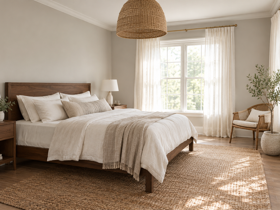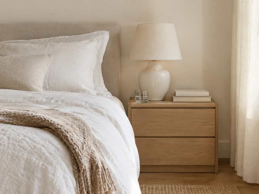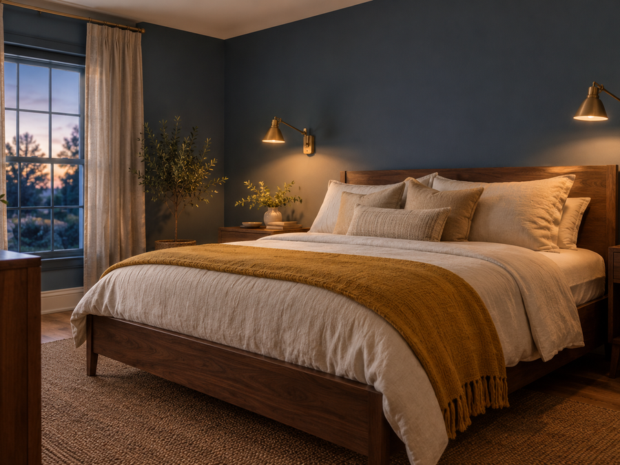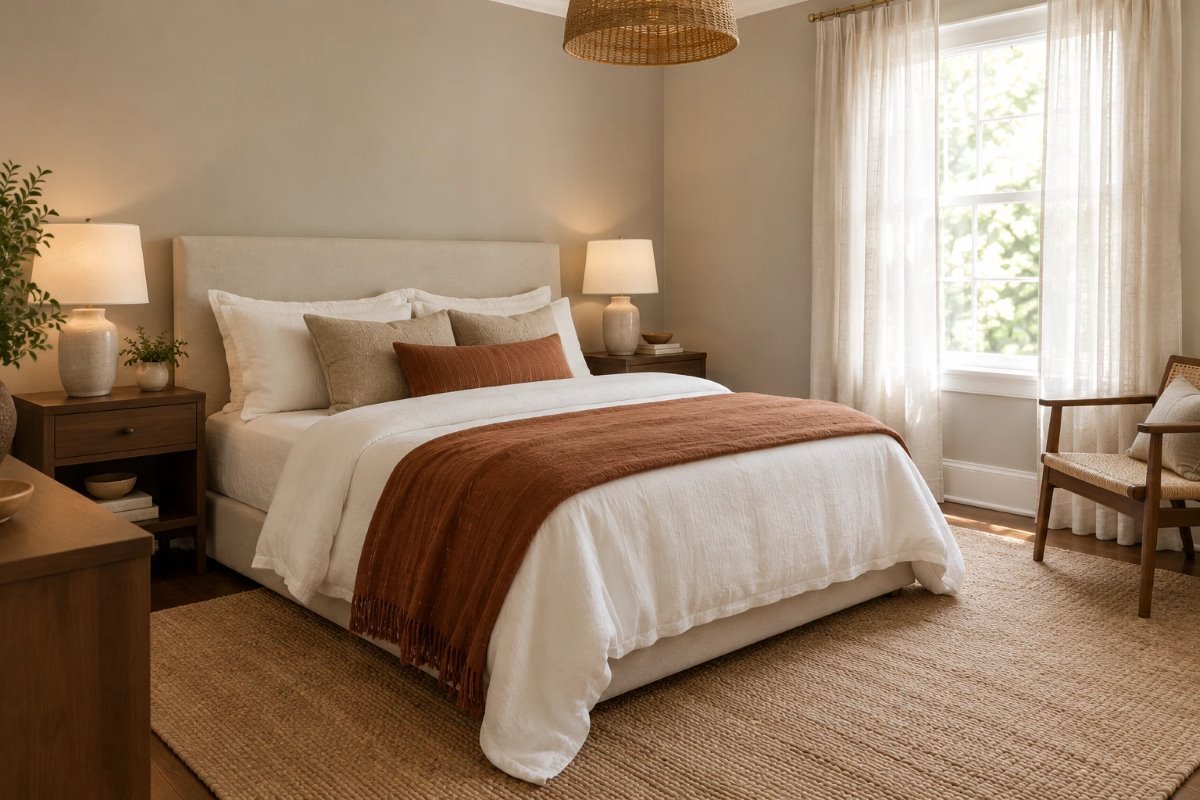
A good greige is hard to find. Many lean too pink, too yellow or too cold, and they look different at noon than they do at night. Benjamin Moore Pashmina is the one designers keep suggesting because it sits right in the middle: a soft, balanced neutral that stays calm in warm and cool light.
This review covers what Pashmina really looks like, its light reflectance value (LRV) and undertones, how it changes through the day, the trim and colors that go with it, and the mistakes that make a greige look flat.
Quick Answer: Benjamin Moore Pashmina at a Glance
- Code: AF-100, from the Affinity collection.
- Color: a balanced greige, between warm and cool.
- LRV: 44.2 (from Benjamin Moore), a true mid-tone.
- Undertone: soft taupe-gray; it can show a faint violet or green hint in some light.
- Best for: bedrooms, living rooms, hallways and whole-house color.
What Pashmina Is
Benjamin Moore describes Pashmina AF-100 as perfectly balanced between warm and cool, light and dark, a sophisticated neutral you can use anywhere. That is what you see on a wall. Benjamin Moore Pashmina is not a beige and not a gray; it is a taupe-gray that behaves like a quiet backdrop, letting wood, linen and art do the talking.
The Undertones
Benjamin Moore Pashmina is a mix of gray and brown, so it avoids the pink of some greiges and the yellow of others. In cool north light it leans a little gray, and in warm south light it feels soft and taupe. Some people notice a faint violet or green hint next to certain fabrics, so check it against your floor, sofa and bedding before you commit.
How Light or Dark Is It? (LRV)
LRV runs from 0 (black) to 100 (white). Benjamin Moore lists Pashmina at 44.2, which makes it a true mid-tone: darker than a light greige like Accessible Beige, but far lighter than a deep neutral. In a bedroom it feels cozy rather than dark, and in a living room it gives walls some presence without shrinking the space.
How It Looks in Different Light
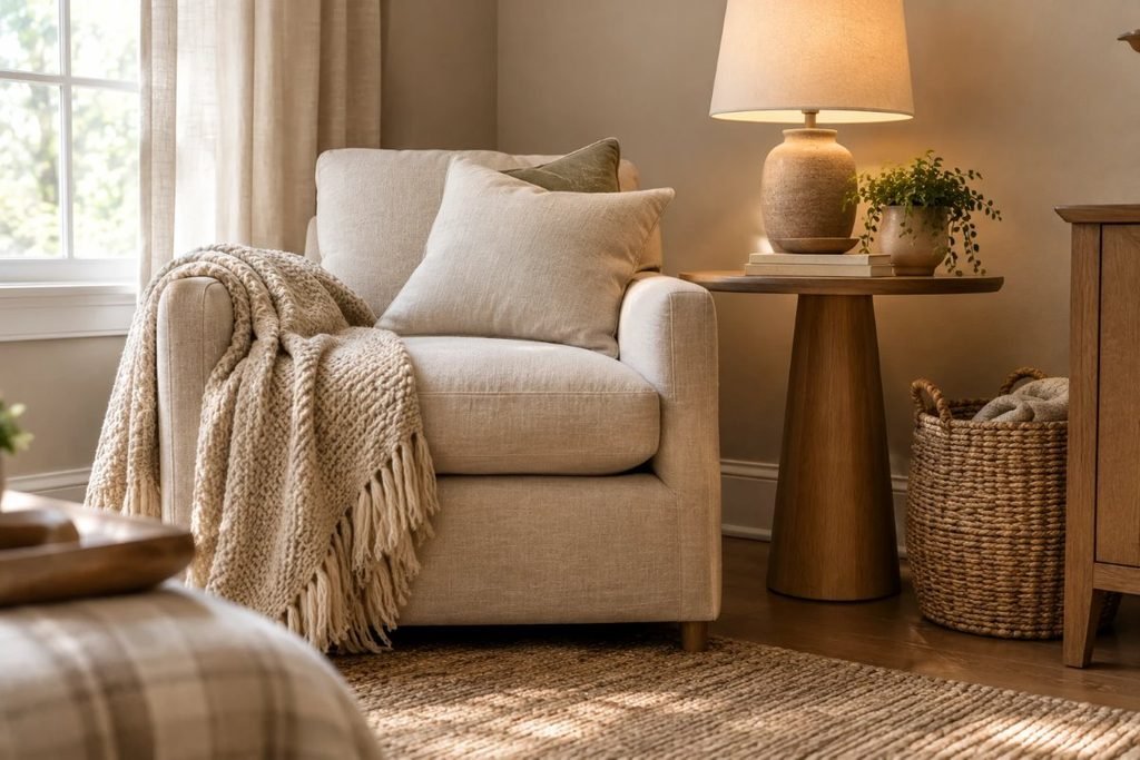
Light changes greige more than you expect, so test it at several times of day.
| Room light | How Pashmina reads | What to do |
|---|---|---|
| North-facing | Cooler, grayer, a little flat | Use warm 2700K bulbs and warm textiles |
| South-facing | Warm taupe, soft | Enjoy it; add cool accents for balance |
| East-facing | Lighter and cleaner in the morning | Check it again in the evening |
| West-facing | Golden and warm late in the day | Avoid yellow-cream trim |
| Evening lamps | Deeper and cozier | Layer lamps at different heights |
Pashmina vs Other Neutrals
Mid-tone neutrals look close on a chip, so compare them side by side. Benjamin Moore lists Plymouth Rock, Baja Dunes, Stone Hearth and Northern Cliffs as similar colors. Benjamin Moore Pashmina is lighter and softer than a deep neutral, and for a darker, richer espresso brown, our guide to Benjamin Moore Silhouette shows what a much deeper shade looks like.
Best Trim and Coordinating Colors
Benjamin Moore lists Deep in Thought AF-30, Cinder AF-705, White Dove OC-17 and Providence Blue 1636 as coordinating colors. White Dove is a soft, warm white that keeps Pashmina crisp without a harsh edge. Deep in Thought and Providence Blue make good accent or door colors, and Cinder gives a deeper contrast for built-ins. Avoid stark blue-whites, which can make the greige look dingy.
Best Rooms and Materials
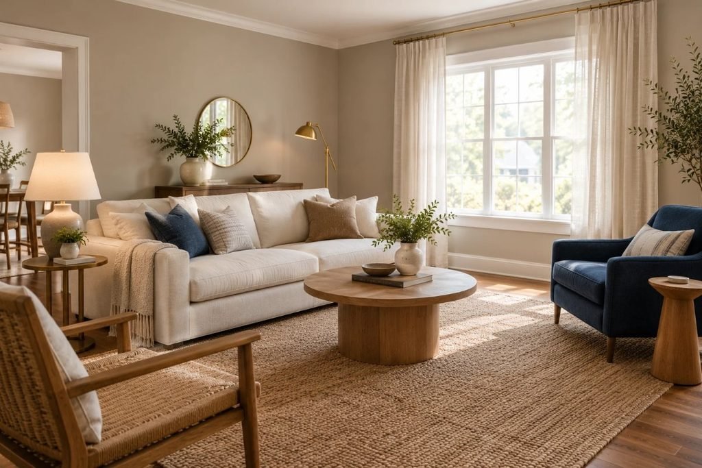
Benjamin Moore Pashmina suits bedrooms, where it feels restful, living rooms, where it pairs with wood and linen, and hallways, where it ties rooms together. It looks best with natural materials: oak, walnut, rattan, jute, wool and aged brass. For a light, airy bedroom to pair it with, see our Scandinavian bedroom ideas.
Pashmina in a Small Bedroom
A mid-tone in a small bedroom feels snug rather than cramped when the ceiling and trim are lighter. Paint all four walls the same color, keep bedding light, and add warm lamps on each side of the bed. Our guide on how to arrange furniture in a small bedroom shows layouts that keep the walkway clear.
Furniture and Flooring Pairings
Benjamin Moore Pashmina looks best with warm woods, cream or white bedding, oatmeal upholstery and brass or black metal. Cool gray floors can make it feel cold, while very orange wood can make it look slightly purple. Add navy, rust, olive or mustard accents to bring it to life.
Doing This as a Renter
Many landlords accept neutral colors, and Pashmina is easy to cover later. If painting is off the table, bring in the look with greige linen curtains, a woven rug and warm-toned art.
Budget and Timing
Benjamin Moore prices vary by product line and store, so check current costs. A mid-tone usually covers in two coats, and an average bedroom takes a weekend. For ways to save across the room, see our guide to cozy bedroom ideas on a budget.
Where to Start If This Is Your First Time
Get a sample and paint a large board, or use a peel-and-stick sample, then move it around the room for a few days. Look at it morning, noon and night. If you still like it, paint a corner and live with it before you do the whole room.
Styling Tips
Layer texture rather than pattern: linen bedding, a wool throw, a jute rug and ceramic lamps. Add one or two deeper accents, such as navy, rust or olive, so the greige has something to play against. Keep art simple in wood or black frames. Benjamin Moore Pashmina is a calm backdrop, so the objects in the room give it personality.
Carrying It Through the Whole House
Benjamin Moore Pashmina is balanced enough to run through a hallway, living room and bedrooms. Vary the accents in each room, such as navy in one and rust in another, and keep the ceilings and trim the same warm white throughout so the whole house feels connected. If a room gets very little light, test it carefully first, since a mid-tone can look darker in a dim space.
Quick Recap
Benjamin Moore Pashmina is a balanced greige with an LRV of 44.2. Pair it with a warm white trim such as White Dove, natural materials and warm lamps, and test it in your own light before you paint.
Common Mistakes to Avoid
- Judging it on a tiny chip. Always test a large sample.
- Using cold white bulbs. They make greige feel flat.
- Pairing it with a stark blue-white trim. It can look dingy.
- Ignoring fixed finishes. Check it against floors and furniture.
FAQs
Is Pashmina warm or cool? Balanced, a taupe-gray between the two.
What is the LRV of Pashmina? 44.2, according to Benjamin Moore.
What trim goes with Pashmina? White Dove OC-17 is a listed coordinating color.
Is Pashmina good for a bedroom? Yes, it is calm and restful.
Is Pashmina a greige? Yes, a balanced one.
Does Pashmina look purple? It can show a faint violet hint in some light.
Tools and Basics to Gather
A large sample board, painter’s tape, drop cloths, an angled brush, a roller, a tray, a stepladder and a primer if the old color is dark. Keep windows open while you paint and follow the safety directions on the can.
The Bottom Line
Benjamin Moore Pashmina is a balanced, flexible greige that works in almost any room. Test it in your own light, pair it with a warm white trim and natural materials, and keep your bulbs warm. Done that way, it is a neutral that feels calm, current and easy to live with.
Related:
Benjamin Moore Silhouette Paint Color · Cozy Bedroom Ideas on a Budget