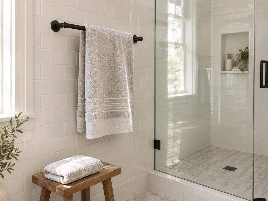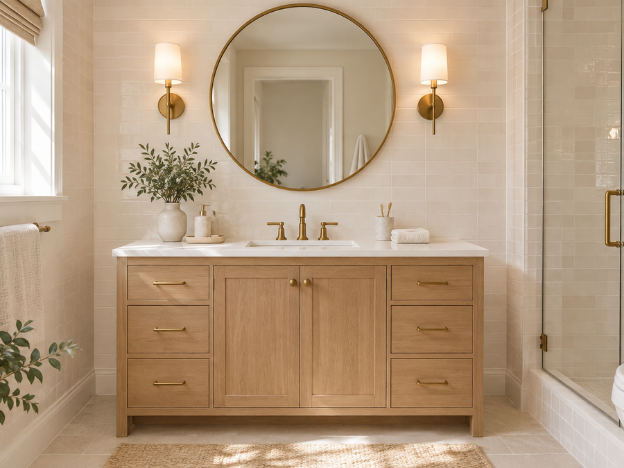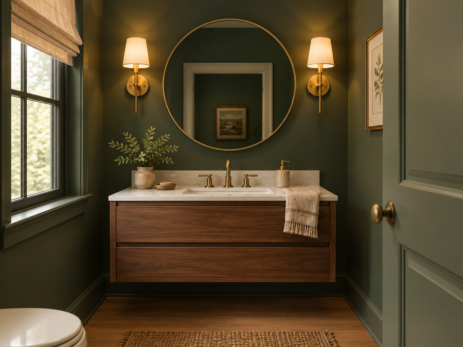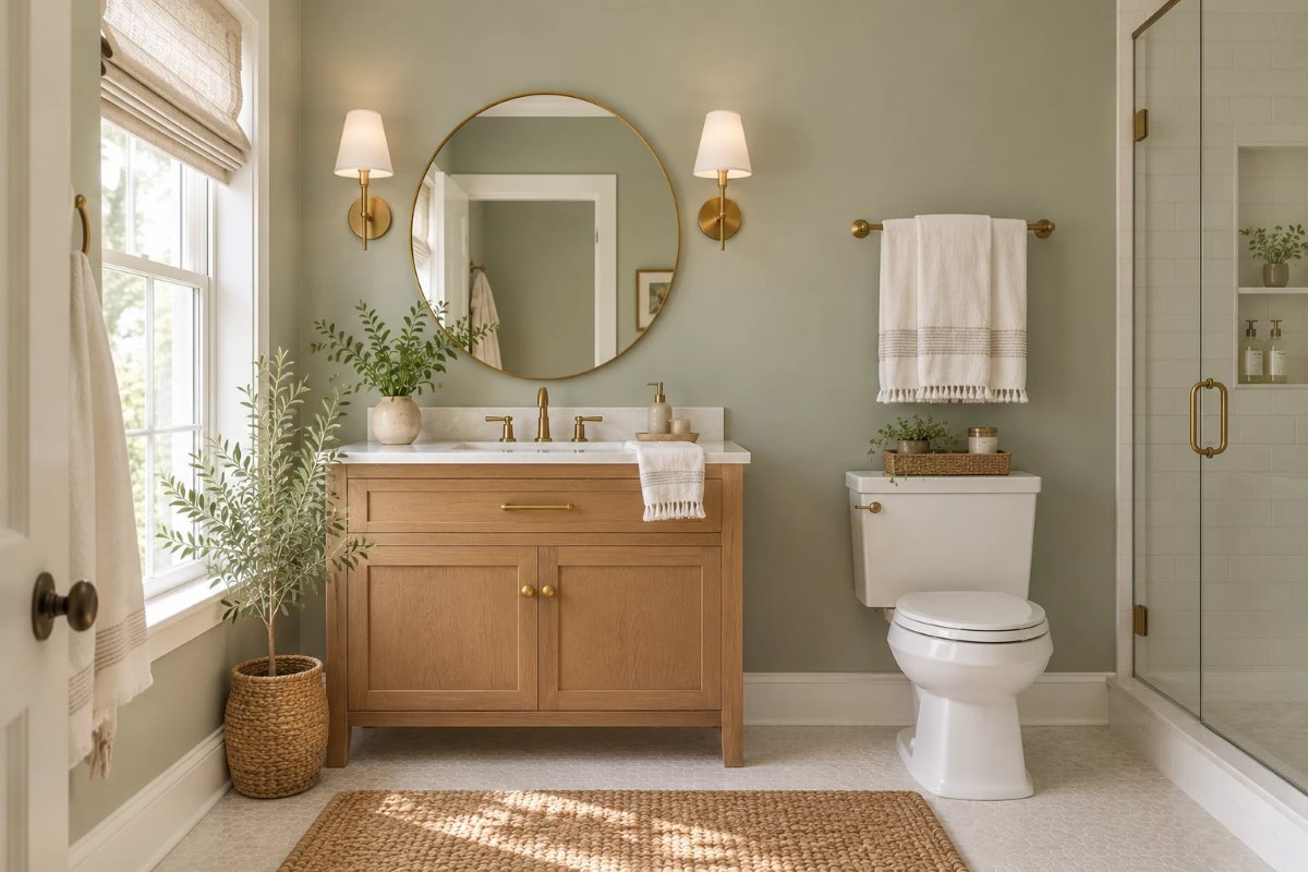
Bathrooms are small, damp and often lit by one bright bulb, so the wall color has to work hard. A color that looks fresh in a paint chip can turn cold, minty or gray under a bathroom light. Quietude Sherwin Williams is a soft, muted green that people choose when they want a bathroom, bedroom or hallway to feel calm without feeling like a spa cliché.
This review covers what Quietude really looks like, its undertones, how it changes through the day, how it compares with other soft greens, which trim and materials suit it and the mistakes that make a soft green look dull. I could not confirm its LRV, so I say so below instead of guessing.
Quick Answer: Quietude at a Glance
- Code: SW 6212.
- Color: a soft, muted green, from Sherwin-Williams’ green family.
- LRV: not listed on the page I read; confirm it on the chip.
- Undertone: green with some gray; it can lean slightly cooler or warmer depending on the light.
- Best for: bathrooms, bedrooms, hallways and small rooms.
What Quietude Is
Quietude SW 6212 sits in the Sherwin-Williams green family next to Pewter Green, Nurture Green, Evergreen Fog and Courtyard. The page text I could read gave no official description or LRV, so here is what you see on a wall: Quietude Sherwin Williams is a gentle, muted green, softer than a bold forest green and more colorful than a gray. It reads like a calm, leafy neutral.
The Undertones
Quietude Sherwin Williams has a green base softened with gray. In most rooms it reads as a soft sage. In cool north light it can look a little grayer or cooler, and in warm light it feels softer and more natural. Some people notice a faint blue or yellow hint next to certain fabrics, so check it against your tile, towels and vanity before you commit.
How It Looks in Different Light
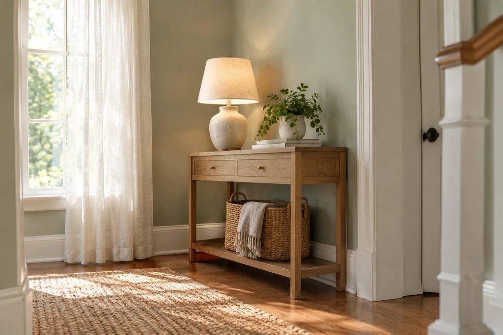
Bathroom light is usually small and strong, so judge this color at several times of day and under your actual bulbs.
| Room light | How Quietude reads | What to do |
|---|---|---|
| North-facing | Cooler and grayer | Use warm 2700K bulbs and warm wood |
| South-facing | Softer, warmer green | Enjoy it; avoid yellow trim |
| East-facing | Fresh and clean in the morning | Check it again in the evening |
| West-facing | Warm and golden late in the day | Add white towels to keep it crisp |
| Bathroom vanity lights | Can look cooler under bright bulbs | Choose warm-white bulbs |
Quietude vs Other Soft Greens
Soft greens look close on a chip, so compare them side by side. Sherwin-Williams lists Nurture Green, Evergreen Fog, Pewter Green and Courtyard nearby. For a dustier, eucalyptus-style green, our Valspar Warm Eucalyptus living room guide shows how another soft green behaves. Quietude Sherwin Williams is a good pick if you want a light, airy green rather than a deep one.
Best Trim and Coordinating Colors
The Sherwin-Williams page text I could read did not list coordinating colors, so choose by eye. A crisp white trim keeps Quietude Sherwin Williams bright and clean, especially in a bathroom, while a warm, creamy white feels softer. Avoid yellow-cream trim, which can make the green look muddy. Pair it with white towels, oak, brass or black fixtures.
Best Rooms and Materials
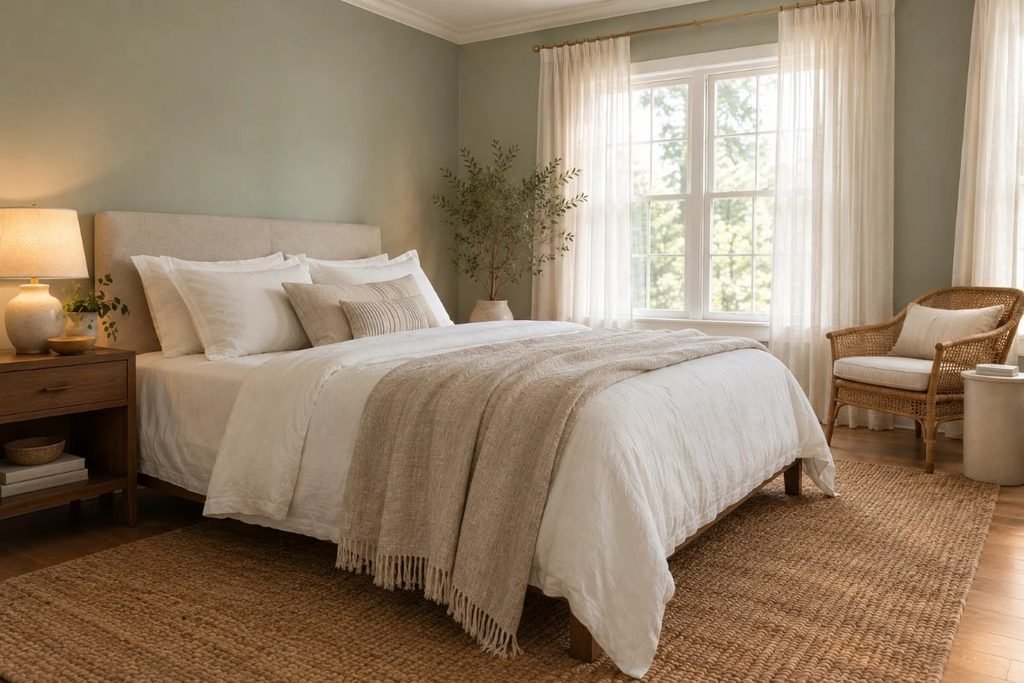
Quietude Sherwin Williams suits bathrooms, bedrooms, nurseries and hallways. It looks best with natural materials: oak, walnut, rattan, linen, cotton and brushed brass. If you like greenery, our guide to biophilic design ideas for apartments shows how plants and soft greens work together.
Quietude in a Small Bathroom
In a small bathroom, a light green keeps the room airy while adding color. Paint the walls and ceiling the same color or use a white ceiling, keep towels white and add a mirror to bounce light. Our guides to small bathroom ideas with storage and small bathroom storage ideas without cabinets show how to keep the room tidy so the color can shine.
Paint Finish for Bathrooms
Bathrooms need a durable finish that handles steam. Choose a paint made for bathrooms, usually in a satin or higher sheen on walls, and a semi-gloss on trim, and always run the fan. Check the can for moisture and mildew resistance, and follow the directions for drying time before you shower.
Furniture and Flooring Pairings
Quietude Sherwin Williams looks best with warm floors and fixtures: oak, walnut, honey wood, white tile and brass. Cool gray tile can make it feel cold, while pink or orange tile can clash. In a bedroom, white linen and oatmeal textiles keep it light.
Doing This as a Renter
Many landlords allow soft neutrals and greens, and a light color covers easily. If you cannot paint, bring in the look with green towels, a shower curtain, a plant and a framed print, or use a removable wall decal.
Budget and Timing
Sherwin-Williams prices vary by product line and store, so check current costs. A soft color usually covers in two coats, and a small bathroom takes a day or a weekend with drying time. A sample costs far less than repainting.
Where to Start If This Is Your First Time
Paint a large sample board and move it around the room for a few days. Look at it in the morning, at noon and under your actual bathroom lights. If you still like it, follow a simple painting order: ceiling and trim first, then the walls.
Styling Tips
Keep the palette simple: white towels, a wood tray, a plant and a brass or black faucet. Add one deeper accent, such as navy or charcoal, so the soft green has something to play against. Quietude Sherwin Williams is a quiet backdrop, so use a few good objects instead of many small ones.
Quick Recap
Quietude Sherwin Williams is a soft, muted green. I could not confirm its LRV, so check the chip. Use bathroom-rated paint, warm bulbs and white or warm trim, and test a large sample before you paint.
Carrying It Through the Home
Because it is gentle, Quietude Sherwin Williams can run from a bathroom into a hallway or bedroom without feeling heavy. Keep the trim and ceilings the same white throughout so the spaces feel connected, and vary the accents: oak in one room, brass in another. If a room gets very little daylight, test it carefully first, since a soft green can look grayer in a dim space.
Quick Fixes if It Looks Too Cool
If your sample looks too gray or blue in the bathroom, switch to warm-white bulbs, add oak or brass, and use cream towels instead of bright white. A small change in light often fixes it before you need a different color.
Common Mistakes to Avoid
- Judging it on a tiny chip. Always test a large sample.
- Using cool white bulbs. They make a soft green look gray or blue.
- Skipping bathroom-rated paint. Moisture can cause peeling.
- Pairing with yellow trim. It can turn the green muddy.
FAQs
Is Quietude a gray or a green? A soft green with gray in it.
What is the LRV of Quietude? Not listed on the page I read; confirm it on the chip.
Does Quietude look blue? It can in cool light; warm bulbs help.
What trim goes with Quietude? Crisp white or a warm, creamy white.
Is Quietude good for a bathroom? Yes, with a bathroom-rated paint and good ventilation.
Is Quietude good for a small room? Yes, it is light and airy.
Tools and Basics to Gather
A large sample board, painter’s tape, drop cloths, an angled brush, a roller, a tray, a stepladder and a mildew-resistant bathroom paint. Keep the fan on or a window open while you paint, and follow the safety directions on the can.
The Bottom Line
Quietude Sherwin Williams is a soft, muted green that makes a bathroom or bedroom feel calm and clean. Test it in your own light and under your bathroom bulbs, pair it with white or warm trim and natural materials, and use bathroom-rated paint. Done that way, it is a gentle color that never feels loud.
Related:
Small Bathroom Ideas With Storage · Valspar Warm Eucalyptus Living Room