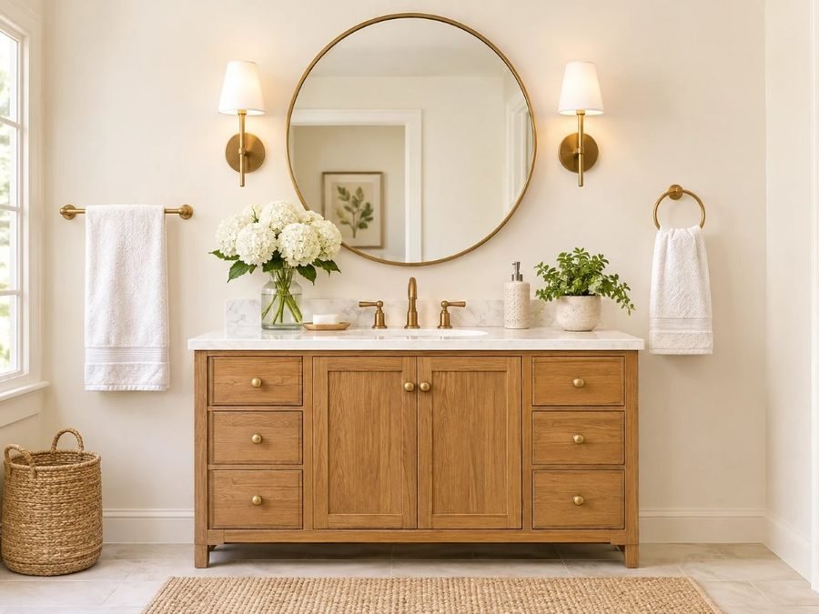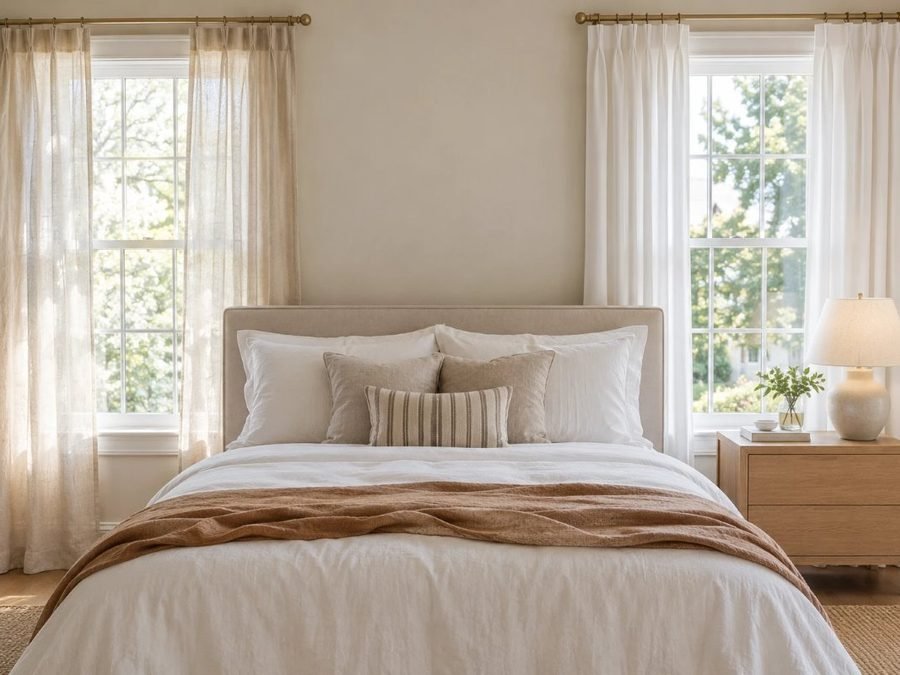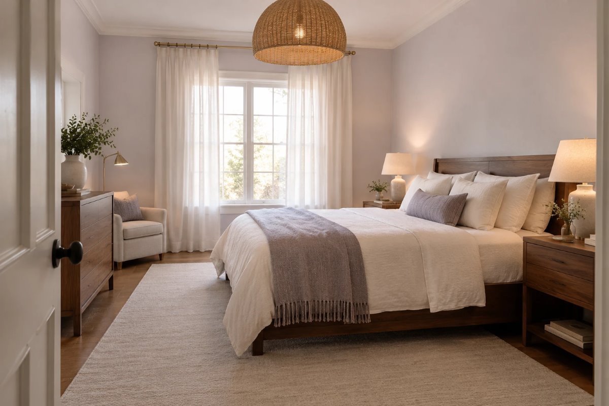
White paint is harder than it looks. Many whites turn blue in shade, yellow in lamp light or flat in a north-facing room. Benjamin Moore Calm is a soft white with a very faint cool tint, and it is a favorite for bedrooms because it feels clean without feeling cold or stark.
This review covers what Calm really looks like, its LRV and undertones, how it changes through the day, how it compares with other soft whites, which trim and materials suit it, and the mistakes that make a soft white look dull.
Quick Answer: Benjamin Moore Calm at a Glance
- Code: OC-22, from the Off White Collection.
- Color: a soft white with the barest hint of lavender-gray.
- LRV: 75.83 (from Benjamin Moore), a light color that reflects most light.
- Undertone: faintly cool, with a lavender-gray tint that shows more in cool light.
- Best for: bedrooms, bathrooms, ceilings, trim and soft, airy rooms.
What Calm Is
Benjamin Moore describes Calm OC-22 as a soothing shade of white distinguished by the barest hint of lavender-gray. That tint is what sets Benjamin Moore Calm apart from a plain white or a warm cream. On a wall it reads as a soft, clean off-white that feels quiet and a little cool, which is why it suits rooms made for rest.
The Undertones
Benjamin Moore Calm has a faintly cool, lavender-gray undertone on a white base. In bright light it reads as a clean soft white, and in cool north light the lavender-gray shows a little more. In warm lamp light it softens and can look closer to a plain off-white. Next to a bright white or a warm cream it can look slightly gray, so check it against your trim, bedding and floor.
How Light or Dark Is It? (LRV)
LRV runs from 0 (black) to 100 (white). Benjamin Moore lists Calm at 75.83, so it is light and reflects most of the light that hits it, but it is not a stark white. That makes it a good choice for bedrooms that need to feel bright without glare.
How It Looks in Different Light
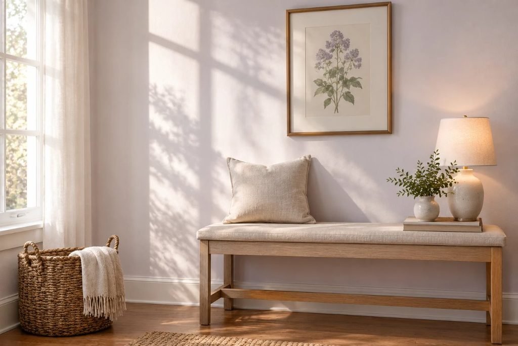
Whites change more with the light than any other color, so judge this one at several times of day.
| Room light | How Calm reads | What to do |
|---|---|---|
| North-facing | Cooler, with more gray-lavender | Use warm 2700K bulbs and warm textiles |
| South-facing | Clean, soft and bright | Enjoy it; add warm wood for balance |
| East-facing | Crisp and fresh in the morning | Check it again in the evening |
| West-facing | Softer and warmer late in the day | Add cool accents if you want crispness |
| Lamp light | Soft, close to off-white | Layer lamps at different heights |
Calm vs Other Soft Whites
Soft whites look close on a chip, so compare them side by side. Using Benjamin Moore’s listed LRVs, here is how Calm compares with two other Off White Collection colors.
| Color | Code | LRV (Benjamin Moore) | How it reads |
|---|---|---|---|
| Calm | OC-22 | 75.83 | Soft white, faint lavender-gray |
| Pale Oak | OC-20 | 68.64 | Warm gray |
| Balboa Mist | OC-27 | 65.53 | Pale gray, slightly warm |
For a different soft white that leans cooler and cleaner, our guide to Pantone Cloud Dancer shows how another soft white behaves.
Best Trim and Coordinating Colors
Benjamin Moore lists Opulence OC-69, Nightingale AF-670, Porcelain 2113-60 and Newburyport Blue HC-155 as coordinating colors. Newburyport Blue is a deep navy that looks crisp beside Benjamin Moore Calm, and works for a door, built-ins or an accent wall. A slightly brighter white keeps trim crisp, and the same color in a satin finish gives a soft, seamless look.
Best Rooms and Materials
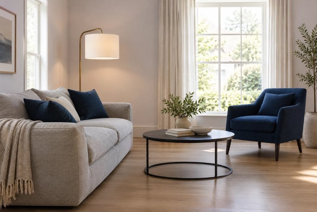
Benjamin Moore Calm suits bedrooms, bathrooms, nurseries, hallways and ceilings. It looks best with natural materials: oak, walnut, linen, wool, rattan and brushed brass, and with navy, charcoal or gray accents. For an airy bedroom that pairs well with it, see our Scandinavian bedroom ideas.
Calm in a Small Bedroom
In a small bedroom, a soft white keeps the room open and bright. Paint the walls and ceiling the same color or use a slightly brighter ceiling, keep bedding light and add warm lamps. For layouts that fit a small bedroom, see our small bedroom ideas.
Calm in Bathrooms and Kitchens
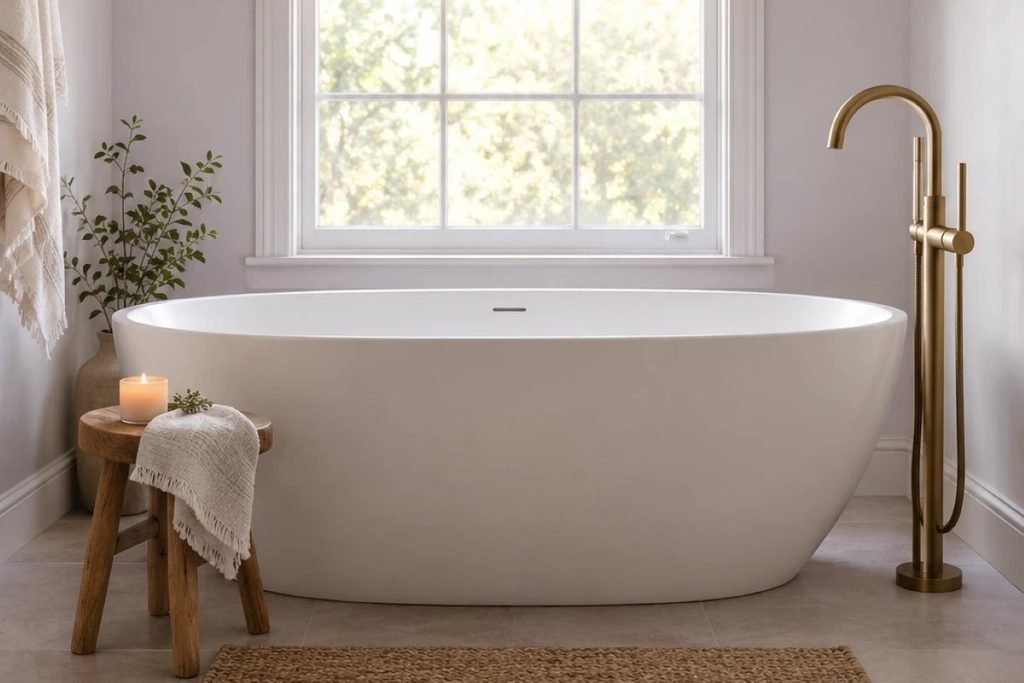
Calm works in bathrooms with a freestanding tub, white tile and brass or black fixtures, where it feels clean and soft. Use a bathroom-rated paint and good ventilation, and test it against your tile so it does not look gray beside a warm white. In kitchens, it pairs with a gray stone counter and brass hardware.
Calm on Cabinets and Doors
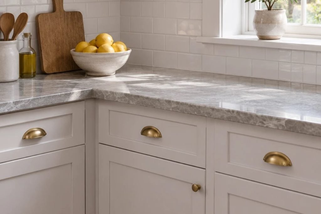
Benjamin Moore Calm can be used on cabinets, built-ins and interior doors for a soft, quiet look. Use a cabinet-grade enamel and a bonding primer, and test it against your counter, since a warm cream counter can make it look cooler. Brass or black pulls both suit it.
Furniture and Flooring Pairings
Benjamin Moore Calm looks best with warm woods, honey oak or walnut floors, and crisp white or oatmeal bedding. Cool gray floors can make it look flatter. Navy, charcoal and olive accents give it contrast, and brass or black metal adds a modern edge.
Doing This as a Renter
Many landlords like a soft white, and Calm is easy to cover or repaint later. If painting is not allowed, bring in the look with white linen bedding, lavender-gray or gray throws and curtains, and a pale rug.
Budget and Timing
Benjamin Moore prices vary by product line and store, so check current costs. A light color often needs two coats, and an average bedroom takes a weekend. For ways to save across the room, see our guide to cozy bedroom ideas on a budget.
Where to Start If This Is Your First Time
Get a sample and paint a large board, or use a peel-and-stick sample, then move it around the room for a few days. Look at it in the morning, at noon and at night with your lamps on. Hold it next to your trim and bedding. If you still like it, paint one wall and live with it before you do the whole room.
Styling Tips
Layer texture rather than pattern: linen bedding, a wool throw, a woven pendant and ceramic lamps. Add one deeper accent, such as navy or charcoal, so the soft white has something to play against. Keep art simple in wood or black frames. Benjamin Moore Calm is a quiet backdrop, so the objects in the room give it personality.
Common Mistakes to Avoid
- Judging it on a tiny chip. Always test a large sample.
- Using cold white bulbs. They make it look gray.
- Pairing it with a warm cream trim. Calm can look cooler by comparison.
- Skipping the side-by-side test with your bedding.
FAQs
Is Calm a warm or cool white? Faintly cool, with a lavender-gray tint.
What is the LRV of Calm? 75.83, according to Benjamin Moore.
Does Calm look purple? Only slightly, in cool light.
What trim goes with Calm? A slightly brighter white, or the same color in satin.
Is Calm good for a bedroom? Yes, it is soft and restful.
Is Calm good for a ceiling? Yes, it is light and soft.
Tools and Basics to Gather
A large sample board or peel-and-stick sample, painter’s tape, drop cloths, an angled brush, a roller, a tray and a stepladder. Keep windows open while you paint and follow the safety directions on the can.
The Bottom Line
Benjamin Moore Calm is a soft white with a faint lavender-gray tint that makes a room feel bright and restful. Test it in your own light, pair it with warm woods, linen and a navy or charcoal accent, and keep your bulbs warm. Done that way, it is a soft white that never feels stark.
Related:
Scandinavian Bedroom Ideas · Cozy Bedroom Ideas on a Budget