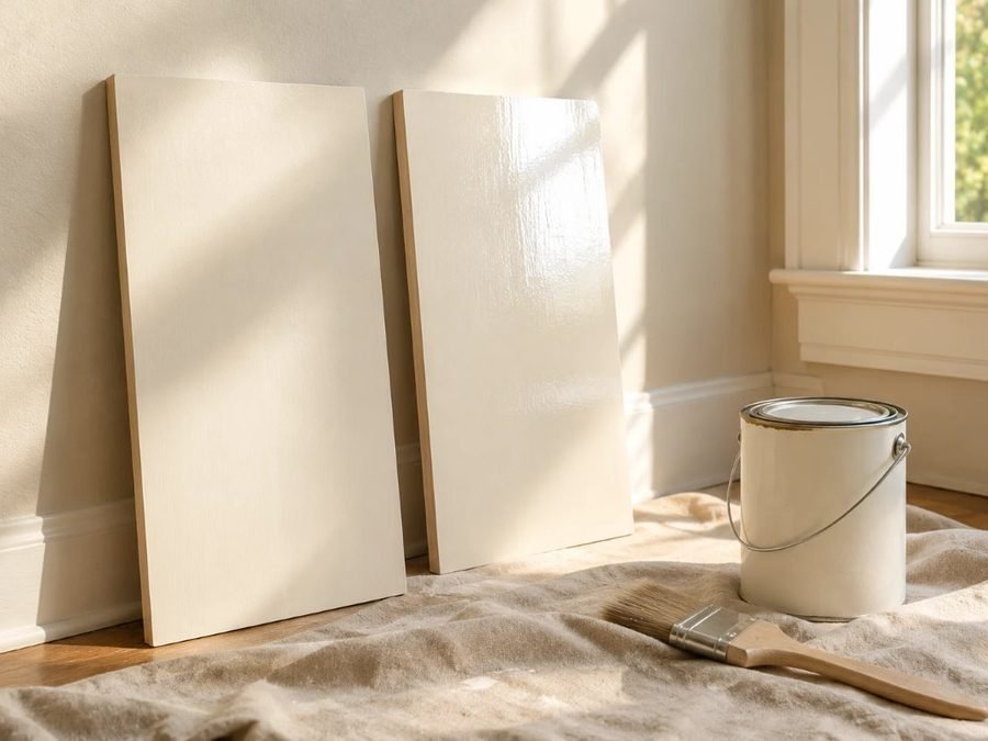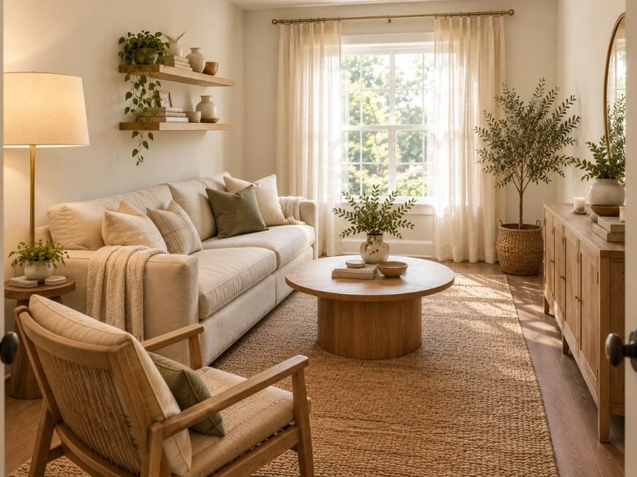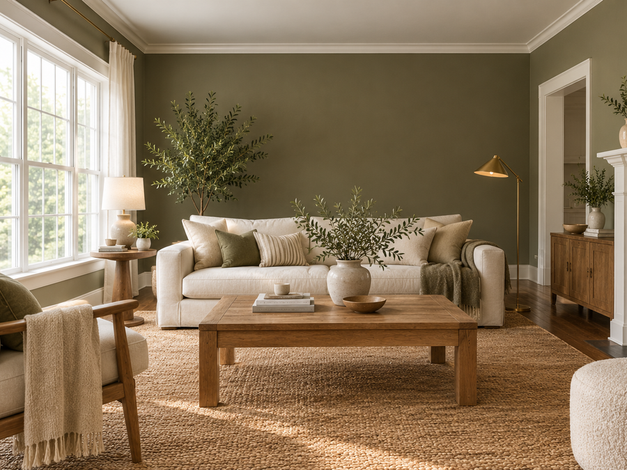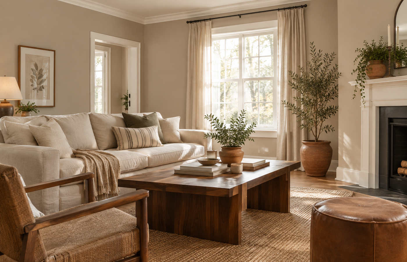
Beige has a bad reputation for looking flat or yellow. Accessible Beige Sherwin Williams is the exception that homeowners keep choosing: a warm, soft neutral with enough gray in it to feel modern and calm. It has become one of the most popular wall colors for people who want warmth without a dated look.
This review covers what Accessible Beige really looks like, its undertones and light reflectance value (LRV), how it changes through the day, how it compares with Shoji White and Alabaster, and where it works best, plus the mistakes that make a greige look dull.
Quick Answer: Accessible Beige at a Glance
- Code: SW 7036.
- Color: a warm greige, a beige with gray in it.
- LRV: about 58 (published), a mid-light color.
- Undertone: warm with a gray lean, rarely pink or yellow.
- Best for: living rooms, bedrooms, hallways and whole-house color.
What Accessible Beige Is
Sherwin-Williams describes Accessible Beige SW 7036 as unlike many beiges, with undertones of gray that give a space a warm, snug feel, and suggests pairing it with earthy tones. That gray is the secret. Accessible Beige Sherwin Williams stays soft and neutral instead of turning yellow or peachy, which is why it works in so many homes.
The Undertones
Accessible Beige Sherwin Williams leans warm, with a gray base that keeps it balanced. In most light it reads as a soft greige. Some reviewers notice a faint green or pinkish hint next to certain fabrics, so always check it against your flooring, sofa and countertops before committing.
How Light or Dark Is It? (LRV)
LRV measures how much light a color reflects, from 0 (black) to 100 (white). Accessible Beige is published at about 58, so it sits in the middle: light enough to keep a room open, deep enough to look like a real color rather than a white. Confirm the figure on the chip, but expect a cozy, not dark, result.
How It Looks in Different Light
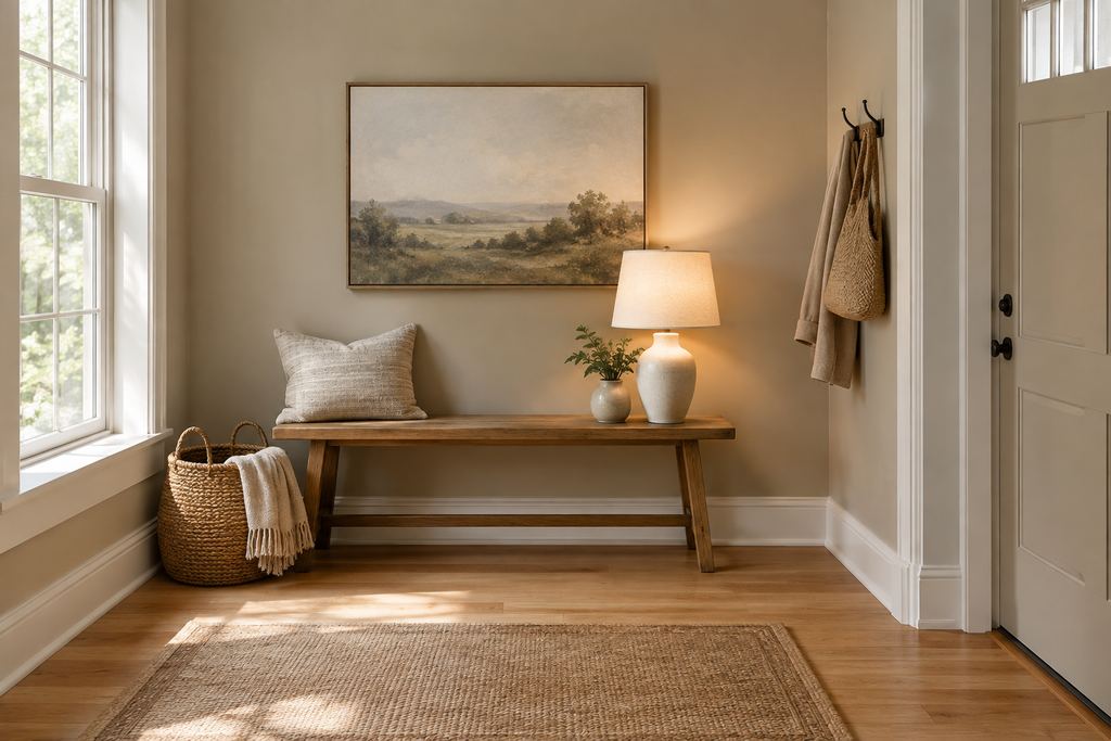
North-facing rooms get cooler light, so Accessible Beige Sherwin Williams looks grayer and a little quieter. South-facing rooms bring out its warmth. East and west rooms shift from fresh in the morning to golden in the evening. Under warm bulbs around 2700K it looks cozier; very cool bulbs can make it feel flat.
Accessible Beige vs Shoji White and Alabaster
People often compare it with two lighter neutrals. Here’s how they line up, using commonly published LRVs:
| Color | Code | Published LRV | How it reads |
|---|---|---|---|
| Accessible Beige | SW 7036 | About 58 | Warm greige, a true wall color |
| Shoji White | SW 7042 | About 74 | Creamy off-white that borders on greige |
| Alabaster | SW 7008 | About 82 | Soft, warm white |
Accessible Beige is the deepest of the three and the most clearly a color. If you want something much lighter, our guide to Pantone Cloud Dancer in a living room covers a soft white.
Best Trim and Coordinating Colors
Sherwin-Williams lists Aesthetic White SW 7035, Sanderling SW 7513 and Cadet SW 9143 as coordinating colors. A warm, creamy white on trim keeps Accessible Beige Sherwin Williams crisp without looking stark. Avoid very cool, blue-based whites, which can make a greige look muddy.
Best Rooms and Materials
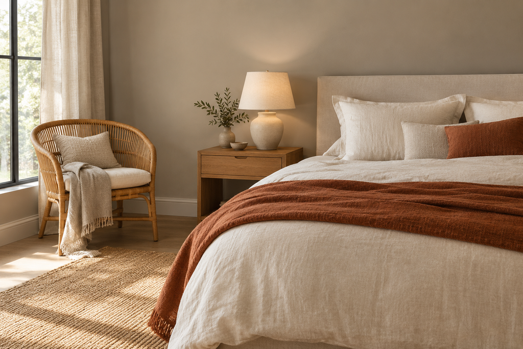
Accessible Beige suits living rooms, bedrooms, hallways and open-plan homes where one color needs to flow through many spaces. It loves earthy materials: warm wood, linen, jute, terracotta and aged brass. For another warm neutral, see our Universal Khaki in a small living room guide, and for cabinets, our kitchen cabinet colour ideas.
Accessible Beige in a Small Space
In a small room, Accessible Beige Sherwin Williams feels snug rather than cramped as long as the ceiling and trim are lighter. Paint the walls and keep furniture light, add a mirror and use warm lamps so the greige glows instead of fading.
Doing This as a Renter
Many landlords allow neutral colors, and Accessible Beige is easy to cover later. If painting is off the table, bring the color in with greige linen curtains, a woven rug and warm-toned art.
Budget and Timing
Sherwin-Williams prices vary by product line and store, so check current costs. A mid-tone neutral usually covers in two coats. An average room takes a weekend.
Where to Start If This Is Your First Time
Get a free chip or peel-and-stick sample and place it on two walls, one bright and one dark. Check it morning, noon and night for a few days. If you still like it, follow our guide on how to paint a room and start with one room.
Pairing It With Flooring and Furniture
Accessible Beige Sherwin Williams looks best with warm floors: honey oak, walnut, tile in sand tones or natural stone. Cool gray floors can make it look slightly yellow, while very orange wood can push it toward pink. Furniture in cream, oatmeal, caramel leather and rattan feels natural, and black or bronze metal adds a modern contrast. If your sofa is cool gray, check it next to your sample first.
Carrying It Through the Whole House
One reason Accessible Beige Sherwin Williams is so popular is that it flows from room to room. Use it in the hallway, living room and bedrooms, and vary the accent colors in each space: soft green in one, rust in another. Keep the trim and ceilings the same warm white everywhere so the whole house feels connected. If a room gets very little light, try one shade lighter there.
Styling Tips
Layer texture rather than pattern: linen curtains, a wool throw, a jute rug and ceramic lamps. Add one or two deeper accents, such as olive, navy or terracotta, so the greige has something to play against. Keep art simple, in wood or black frames. Plants look especially good against a warm neutral wall.
Accessible Beige on Cabinets and Exteriors
Accessible Beige Sherwin Williams is also used on kitchen cabinets, built-ins and exteriors. On cabinets it looks soft and earthy next to brass or black hardware. On exteriors, strong daylight lightens it, so test a large sample on the north and south sides of the house first.
Quick Recap
Accessible Beige Sherwin Williams is a warm greige with an LRV of about 58, gray undertones, and a friendly, snug feel. Pair it with a warm white trim and earthy materials, and test it in your own light before painting.
Common Mistakes to Avoid
- Pairing it with cool, blue-white trim. It can turn the greige dull.
- Judging it on a tiny chip. Always test a large sample.
- Ignoring fixed finishes. Check it against flooring and counters.
- Using very cool bulbs. They flatten warm neutrals.
FAQs
Is Accessible Beige warm or cool? Warm, with a gray lean that keeps it balanced.
What is the LRV of Accessible Beige? About 58, a mid-tone neutral; confirm on the chip.
What trim goes with Accessible Beige? A warm, creamy white; Sherwin-Williams lists Aesthetic White as a coordinating color.
Is Accessible Beige too dark for a small room? No, it’s mid-light, especially with a lighter ceiling and trim.
Is it the same as greige? Yes, it’s a classic greige, a mix of beige and gray.
What color is darker than Shoji White? Accessible Beige, at about 58 versus about 74.
Tools and Basics to Gather
A chip or peel-and-stick sample, painter’s tape, drop cloths, an angled brush, a roller, a tray and a stepladder. Keep windows open and follow the safety directions on the can.
The Bottom Line
Accessible Beige Sherwin Williams is an easy, warm greige that works in almost any home. Test it in your own light, pair it with a warm white trim and earthy materials, and keep your bulbs warm. Done that way, it’s a neutral that never feels boring.
Related:
Universal Khaki in a Small Living Room: Genuinely Easy Tips · Kitchen Cabinet Colour Ideas